On October 18th, I finally cut up the pile of old tee-shirts spanning from middle school through the present. I filled a 10 gallon plastic tub with the refuse and felt a sudden burning shame. Sure, the material was cotton, but to just throw them away...[this is what got me into trouble in the first place].
My plan was to make a tee-shirt quilt out of the screen prints. Okay, so that's still my plan with what to do with the screen print pictures. It's the rest of the tees that is the problem.
So I did a quick google search: "what to do with old teeshirts". and here are a few things. Besides a quilt. Which they will gladly do for a fee at... or you could ask me to do it for way less money.
Tee-shirt headband - CraftSnob
t-shirt-handbag - Craftbits
tee-shirt tug-a-toy - Craftbits
tee-shirt diaper - Natural Violet
t-shirt boa - Generation T
Poetic pocket square - Generation T
t-shirt placemats - Crafters Love Crafts
teeshirt doggy bed - The Eco Chic
napkins from old fabric - Greenworld 365
totebag - Instructables
toddler teeshirt dress - Grosgrain [my mother did this with rib knit tanks and seersucker one summer]
tee-shirt lappy case - MAKE
empire cut blouse - CutOutAndKeep
tee-shirt shrug also from CutOutAndKeep, and VERY cute. not something I'll be trying with any of the aforemention, re-purposed leftovers that I have.
None. Absolutely none of this research came to fruition. Not that I'm not glad to have it in the file folder, but I discovered that suddenly, actually finishing something was far more important to me than having projects laying around. Of which I have plenty.
Now that Lent is almost over, I think, in the spirit of Lenten disciplines, my "doing it for Lent" discipline will be to finish what I've started. No new projects. Completion. Salvaging what's left of something if the materials ran out. Which means I'll have to get creative, in some cases.But that is what it's all about.
Tuesday, March 27, 2012

Tuesday, March 20, 2012
30's blue


Last summer I found a quilt at a garage sale that had probably been made in the 1930's. I paid a whopping $5 for it. By the look of it, someone intended to put one more row of blocks on it, but for what ever reason never finished. In it's original condition, it measured at 46" wide by 76" inches long - standard twin blankets are about 68" x 86", which was one thing that led me to believe it was unfinished. Another clue was that one of the corners was missing it's white triangle, and another had a doubly large one sewn on that was the same size as the other triangles along the side of the quilt that joined blocks together. I wasn't terribly interested in making 8 more blocks to match and round out the rest of the quilt at a width of 55", so I started this project by removing the three remaining white triangle corners.

and adding corners of a 30's reproduction that was in my stocking for Christmas...

...and then sashed it with the blue cairn puppies, which I had purchased at Muddy Creek Originals
on my way back from spring break. The puppies are wearing what I assume to be kilts?
I wanted to tie the blue alphabet bears in a little more, so I constructed pinwheel blocks for the corners.


The original maker used five different fabrics for this project. The majority of blocks are made with white fabric and one blue print, although some of the blocks are combinations of fabrics to make a complete block. The blocks themselves aren't arranged in any particular order or fashion, the prints are scattered around.
I added 13 [finished] inches to the overall width and length of the quilt, so it's new dimensions are 59" x 89" with the blue sashing and the pinwheel corners. The present plan is to find some additional 30's blue and add a minimum of 6", but no more than 10" of sashing to increase the overall width to something closer to 65"-69".
And then I'll agonize over what fabric to pick for the back...
Monday, March 19, 2012
NPQG Show, Ross Twp.
Last Friday I had the privilege of spending the afternoon with two very dear friends, CJVSK and MAT at the NPQG show. I'd never been to this guild's show before; CJ and M were first timers.
And I forgot my camera. *facepalm*
So these are the horid pictures from my mobile.


And I forgot my camera. *facepalm*
So these are the horid pictures from my mobile.


There were three of these total at the show; if I remember correctly, it was a guild project. There was an interesting small scale project the guild had done that involved selecting three crayons at random, and making something out of the resulting colors. These crayon projects were grouped together, but these black, white and red samplers were spread out through the show, which I found mildly frustrating since it gave my friends and I a strong sense of deja vous each time we came across one. We would have been very interested in seeing them grouped together for comparison, or at least to calm the feelings of confusion.


I really liked this label; thinking of doing one for the next gift I have to finish, except that I plan on incorporating it into the back of the quilt instead of stitched on after the fact.
Tuesday, March 13, 2012
zen. simplicity.
I stumbled upon these really sweet [read:adorable, teeth-rotting-cuteness] little patchwork fabric buckets.
I have nothing against patchwork. But now, I'm in the school of a row of sameness creates visual calm on a shelf. And I'm in the mood to create some visual camouflage. I'm also in the mood to not cut out a bunch of squares and sew them together (have we heard of strip quilting and stack-and-whack? no? poor, poor soul.)
Okay, in the spirit of brutal honesty, I'm in the mood for someone else to do 90% of the work around here. But this is simple. And pretty put together. Out of stash materials. Fat quarters. Ideally, I'd have 3 fabrics, and I'd make a whole matching set of them to corral miscellaneous but related items in my spotless living room, giving the illusion that I am organized ... let's just start with making the buckety baskety bags, shall we?
 How you decorate the outside is up to you. Penguins like patchwork. I'm shooting for using up my stash. Also, less cutting is awesome. Requires way less thought. I picked out 4 matching fat quarters for the interior lining. That said: Utilize Fat Quarters. Use two, one for the lining and the other for exterior, or make like I did and piece an exterior out of longish scraps.
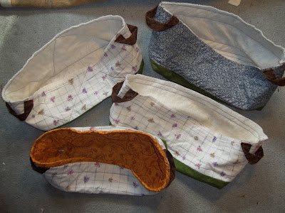
I had some extra batting, so I decided to make one more, with a blue exterior. The interiors are all the same gold viney material.


 Time to attach the buckety baskety handles! Again, in an attempt at sameness, I opted to use the same type of fabric. Conveniently, I had four ~9" squares pre-cut out of a textured brown cotton, which I cut in half down the middle as shown. Those are a pair of Gingher 8" dressmaker shears, more or less for scale purposes. The rough, long edges of the rectangles are folded in towards each other so that they are more or less equally spaced on either side, long sides meeting in the middle. With the long, rough sides remaining in the middle, the new rectangles are folded in half again, and stitched closed along the edge where the two folds meet. Neat, clean, easy. We like easy.
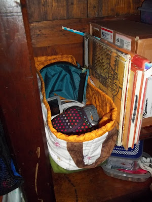
Action shot!
Over all, this wasn't a bad project. The depth of my shelves are conducive to using a fat-quarter length, and the finish width of this bucket is actually about the size of a CD case. Too bad I already have a CD storage system, because these are really cute.
I have nothing against patchwork. But now, I'm in the school of a row of sameness creates visual calm on a shelf. And I'm in the mood to create some visual camouflage. I'm also in the mood to not cut out a bunch of squares and sew them together (have we heard of strip quilting and stack-and-whack? no? poor, poor soul.)
Okay, in the spirit of brutal honesty, I'm in the mood for someone else to do 90% of the work around here. But this is simple. And pretty put together. Out of stash materials. Fat quarters. Ideally, I'd have 3 fabrics, and I'd make a whole matching set of them to corral miscellaneous but related items in my spotless living room, giving the illusion that I am organized ... let's just start with making the buckety baskety bags, shall we?
 How you decorate the outside is up to you. Penguins like patchwork. I'm shooting for using up my stash. Also, less cutting is awesome. Requires way less thought. I picked out 4 matching fat quarters for the interior lining. That said: Utilize Fat Quarters. Use two, one for the lining and the other for exterior, or make like I did and piece an exterior out of longish scraps.
 I had some extra batting, so I decided to make one more, with a blue exterior. The interiors are all the same gold viney material.


Once the exteriors are pieced together, it's time to attach the batting to the exterior. Penguins recommend quilting, with which I concur. Not having and itches to stitch in [referencing quilting done in seam lines] I opted for quilting simple rectangles.Except on this little one on the right, which I tried quilting triangles. It did not work out quite so well.
 Time to attach the buckety baskety handles! Again, in an attempt at sameness, I opted to use the same type of fabric. Conveniently, I had four ~9" squares pre-cut out of a textured brown cotton, which I cut in half down the middle as shown. Those are a pair of Gingher 8" dressmaker shears, more or less for scale purposes. The rough, long edges of the rectangles are folded in towards each other so that they are more or less equally spaced on either side, long sides meeting in the middle. With the long, rough sides remaining in the middle, the new rectangles are folded in half again, and stitched closed along the edge where the two folds meet. Neat, clean, easy. We like easy.
Rummaging around in the stash suitcase (you know, for quick getaways), I pulled out some random pieces that I knew I wouldn't find chaotic on a shelf. Blue is the odd man out since there's not enough of the cream floral check to go around a 4th buckety-basket. And then I hauled out this piece of left over green to unify the bottom pieces. Easy-peasy so far. Unifying color on the bottom = good. I trimmed the scrap materials to 22" long to match the bucket lining. I cut the cream fabrics in half longways, measured the two of them, and figured out I'd need 8" of my selected bucket bottom - the loverly bottle green. Finished, the green will be 7 1/2", figuring in 1/4" seam allowances, making the cream strips a little under 6". The blue was a little less conveniently cut, so I waited until I had the cream figured out and used it as a pattern. To make it go a little faster, I chain stitched everything, that is to say, once I had the first one figured out, I constructed each part of the bucket at the same time; all the linings were sewn at the same time, all the handles, all the exteriors, et cetera. It's a little like an assembly line principle.

Action shot!
Once the lovely baskety-buckets are sewn together, they can be put to work, corralling all those little odds and ends... in this case, my frequently used electronic devices and accessories.
Over all, this wasn't a bad project. The depth of my shelves are conducive to using a fat-quarter length, and the finish width of this bucket is actually about the size of a CD case. Too bad I already have a CD storage system, because these are really cute.
Wednesday, February 29, 2012
spring break, deux
with the help of Jinny Beyer's "The Quilter's Album of Patchwork Patterns", I did some more work on the sampler. Had I done a little more traveling across the United States, I would lack for no shortage of blocks with state names, roads, and other assorted locations and things of historical importance. Alas that my travels across the States have been limited. Alas that there are few blocks having to do with anywhere international


 |
| because none of my layouts would be complete with out Lydia 's approval |

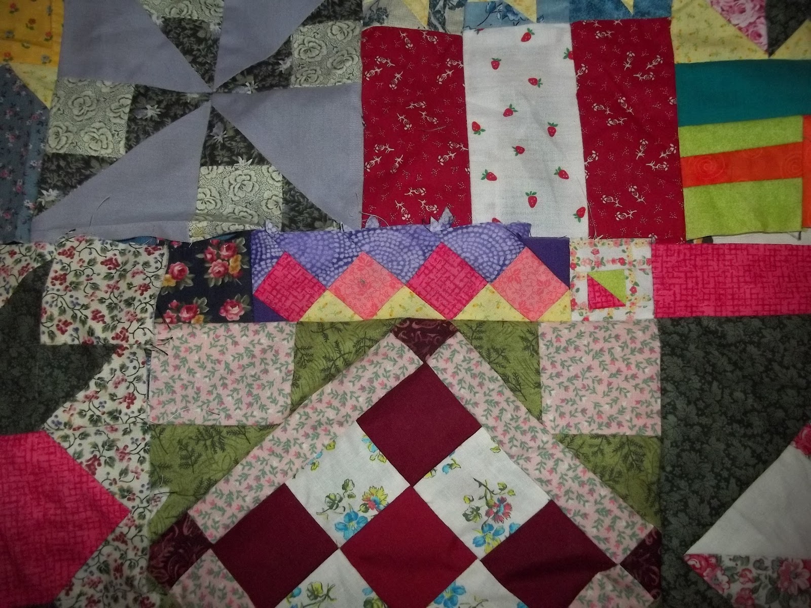
I ended up doing a lot of small piece work with no particular pattern to help make up deficits in size between the pieced sections. The bobbin is for scale purposes. Jinny Beyer was incredibly helpful in providing some piecing ideas - the coral and pink squares in the right photograph were taken from a larger block.

Something I hadn't thought about was the semaphore alphabet - flags used, for maritime purposes, to send messages. Each flag represents a letter of the alphabet, but alone has some other attached meaning. In Erie, Pa, on the Bayfront, is the Erie Convention Center. It's a lovely facility, with a hotel build next-door, and they are connected by a skywalk. The sign at the front of the property has ERIE spelled in semaphore flags.
Sew... if they can do it on the Bayfront, why can't I do it in a quilt and pop my signature in there? Unfortunately, spring break was far too short, and I didn't actually finish this project. I was close, but I had neglected to iron the patchwork as I went, which was an incredible error. It meant that I spent the last night of my stay at home ripping out seams to keep the piece from buckling in places. But, there's always the next visit home. Maybe by then I'll have a sashing picked out.
Tuesday, February 28, 2012
spring break
I'm visiting with my parents for a few days over spring break, and I decided to try to wade some of the left-behind fabric. Probably not a good idea, but then, neither was stumbling upon www.ikeahackers.net.
In the flotsam and jetsam of fabric, I found a B&N bag with patches in it from a long abandoned sampler project. After a few hours of frogging seams, I remember why.
 this is nothing that goes together! most of these aren't even the same size! oh, to be young and foolish again...

 so I spent the afternoon trying to make sense of it. I had decided initially to sash things to make them fit with other blocks. In some cases, this was fine, in others, it was a very disruptive attempt at order our of chaos.
I did a web search of "sampler quilts" and was slightly dissapointed to not find anything like this. What I noticed, and what was less surprising was that most of the samplers followed some sort of colorway, which this does not. There were a few interesting mod sampler quilts. Again, they had an organized and preempted colorway.
I honestly can't remember why I made this design choice. This project exploded from a long past issue of Quilt Sampler Magazine. The article off of which the sample project was based had made two projects for her sons, each one telling his life's story up until that point. I probably had some romantic notion about a story in blocks, which is why I forged ahead as a novice with out a second thought to picking a colorway, as the article's quilter had. To my delight, there is enough commonality between certain blocks that the color families are similar.
In the flotsam and jetsam of fabric, I found a B&N bag with patches in it from a long abandoned sampler project. After a few hours of frogging seams, I remember why.


 so I spent the afternoon trying to make sense of it. I had decided initially to sash things to make them fit with other blocks. In some cases, this was fine, in others, it was a very disruptive attempt at order our of chaos.
 I did a web search of "sampler quilts" and was slightly dissapointed to not find anything like this. What I noticed, and what was less surprising was that most of the samplers followed some sort of colorway, which this does not. There were a few interesting mod sampler quilts. Again, they had an organized and preempted colorway.
I honestly can't remember why I made this design choice. This project exploded from a long past issue of Quilt Sampler Magazine. The article off of which the sample project was based had made two projects for her sons, each one telling his life's story up until that point. I probably had some romantic notion about a story in blocks, which is why I forged ahead as a novice with out a second thought to picking a colorway, as the article's quilter had. To my delight, there is enough commonality between certain blocks that the color families are similar.
To my dismay, the blocks are of such uneven sizes that I will probably have to make a few more before this is all over. Looking at some of the mod quilts, I thought it possible to piece together the blocks into chunks, then sash the sample chunks together with a solid background, letting the chunks float as mini quilts in one larger piece.
Perhaps I'll just wait to see how far this last ditch stitching effort gets me.
Sunday, February 12, 2012
procrastination at it's finest
Let's add blogging to the list, since sewing something like this is already on there. I'm avoiding a project for class, due on Monday. No idea how to even start this, so the materials sit in the back seat of the car while I try [as well as avoid] brainstorming ideas. What doesn't help is a remarkable bitterness in seeing other people following their bliss and actually making a go at it, whereas I tried and failed. I realize I'm making generalizations about people's lives on the five second sound byte I hear, because everyone lies, even if it's only a little bit, about their lives. Call it an omission of truth if you want. People envy me the talent I display knitting socks. I envy them their stable jobs. Or relationships. Their cars that aren't falling apart. Sometimes envy is too gentle a word.
And I'm a little upset with this professor, who despite the pleas of the entire class to extend the due date, insisted we capable people would be able to turn this project over the the space of a week. I'm a little embittered about that one as well.
And I'm turning 27 on Tuesday. Yeah. I know. I'm a baby.
And I'm a little upset with this professor, who despite the pleas of the entire class to extend the due date, insisted we capable people would be able to turn this project over the the space of a week. I'm a little embittered about that one as well.
And I'm turning 27 on Tuesday. Yeah. I know. I'm a baby.
Monday, February 6, 2012
everybody raise a glass

We placed an order with a supplier we haven't used in over a year, and we got these really cute mugs. They were fairly inexpensive, and nicer than the ones of comparable price, and since we still had a truck load at the time, I bought up a bunch.


These were all taken before the mug was fired. There are five owls total, and I used a technique on the tree and sky called s'graffito, where several layers of a base coat are applied and incised with a design, over which a second color is applied, then wiped off down to the first color. It's a little more apparent post-firing because right now the blues look almost the same.


ceramics, limited
And it's February already. Wow. Blog management has not been high on my list of things to do.I've been trying to get ahead with Christmas presents... it's never too early to find presents for people and squirrel them away. So I've been working on some mugs for people. The other gift related item I've been painting are switchplate and outlet covers. Here are a few covers I did at work. I was experimenting with a specialty glaze for the switch and outlet combo. Be forewarned, I use less-than-laymen's terminology in the following explanations.

 The plate on the left is pre-fire, the one on the bottom is post firing. Very, very different! The glazes we use for the majority of pieces are called under-glaze; they're essentially pigmented clay. An under-glaze doesn't run, and the color in the bottle is at least semi-representative of what it will look like when completed. Pink looks pink, purple looks purple and so forth. The intensity of the color is what changes after being fired, but for the most part, you can get an idea of what it will probably look like when done.
Obviously, the finished piece here doesn't exactly look like the one at the beginning of the process. For starters, it looks like terracotta with bits of stuff stuck in it. Secondly, the polar bears do not look the same from start to finish. They're a little fuzzy. The snow on the bottom of the piece is a white under-glaze with a little grey added (all bisque unpainted fires white), and I wanted there to be some definition between the snow and the bears without the bears being painted yellow. Also, the color is drastically different, and there appear to be little explosions of color in the finished piece. I used for the top part of this plate a true glaze, which is effectively pulverized glass. Clay doesn't run when fired; Glass runs a marathon. I knew from the example tiles that the bits of stuff would result in a puddle of something unusual; what I didn't know was exactly how it would turn out. I think that's the beauty of a pottery or crystalline glaze; it's absolute unpredictability and resulting uniqueness. I chose this crystalline glaze because I wanted to achieve something like the night sky without having to paint stars. It reminds me a little more of falling snow, and for the bears, I feel that is a better setting. In any case, I hope the recipient likes it.
Here is another picture of a pre-fire. This used exclusively under-glazes. It is a gift for some friends, who will appreciate my sentimentality when they see themselves on top of the bluff. It was shamelessly rendered from the image on the right, and I'm a little nervous about how it will come out of the kiln. Did I get the ocean right? Are the trees the right color? Will you be able to tell that I put a couple on the mountain instead of a lone hiker? Will there be any differentiation in the land and islands on the horizon, or is the color not mixed with enough of another tone? Did I miss a spot?! Only 24 hours will tell. That's how long it takes for a kiln to properly cycle.


 The plate on the left is pre-fire, the one on the bottom is post firing. Very, very different! The glazes we use for the majority of pieces are called under-glaze; they're essentially pigmented clay. An under-glaze doesn't run, and the color in the bottle is at least semi-representative of what it will look like when completed. Pink looks pink, purple looks purple and so forth. The intensity of the color is what changes after being fired, but for the most part, you can get an idea of what it will probably look like when done.
 Obviously, the finished piece here doesn't exactly look like the one at the beginning of the process. For starters, it looks like terracotta with bits of stuff stuck in it. Secondly, the polar bears do not look the same from start to finish. They're a little fuzzy. The snow on the bottom of the piece is a white under-glaze with a little grey added (all bisque unpainted fires white), and I wanted there to be some definition between the snow and the bears without the bears being painted yellow. Also, the color is drastically different, and there appear to be little explosions of color in the finished piece. I used for the top part of this plate a true glaze, which is effectively pulverized glass. Clay doesn't run when fired; Glass runs a marathon. I knew from the example tiles that the bits of stuff would result in a puddle of something unusual; what I didn't know was exactly how it would turn out. I think that's the beauty of a pottery or crystalline glaze; it's absolute unpredictability and resulting uniqueness. I chose this crystalline glaze because I wanted to achieve something like the night sky without having to paint stars. It reminds me a little more of falling snow, and for the bears, I feel that is a better setting. In any case, I hope the recipient likes it.
Here is another picture of a pre-fire. This used exclusively under-glazes. It is a gift for some friends, who will appreciate my sentimentality when they see themselves on top of the bluff. It was shamelessly rendered from the image on the right, and I'm a little nervous about how it will come out of the kiln. Did I get the ocean right? Are the trees the right color? Will you be able to tell that I put a couple on the mountain instead of a lone hiker? Will there be any differentiation in the land and islands on the horizon, or is the color not mixed with enough of another tone? Did I miss a spot?! Only 24 hours will tell. That's how long it takes for a kiln to properly cycle.


Friday, November 11, 2011
QCE Show, take 2
There are two additional sets of pictures from the Quilt Company East's 3 Lakes show that I haven't posted, mostly because I felt they fell into separate categories other than just quilt. First, we'll talk soft sculpture. AKA awesome.


So, if you haven't guessed, I'm an fantastical beasts kind of person. Have always loved fairy tales - I'm loving ABC's Once Upon a Time with it's undercurrents of the redemption of creation. Something about fairytales that has always fascinated me is relates to a principle of physics - to every action there is an equal and opposite reaction. Now it took us until Newton to put stuff like that into words, but somewhere, people had an understanding of this in their subconcious. Death curses broken love. Even Russian fairytales - take Sleeping Beauty, for example. Story didn't end - sorry, Disney - with the Philip and Aurora dancing in the castle with Aurora's magic pink-and-blue gown (purple, ladies? nice compromise there, what say?) Aurora and Philip move in with none other than Philip's mother. Maybe it was step mother, that part is a little dicey, and of course, it would have been rude to toss her out on her ear just because the young couple is ready to start life together. Aurora and Philip have two beautifully radiant children, a boy and a girl, and everything is wonderful until Philip has to ride off to war, leaving behind Aurora and the children. And Grandmere. Who, at this point it is incumbent to mention, is an ogress. An ogress with a tooth for manflesh, as the Orcs put it. In this case, her grandchildren.
So for a recap up to this point; death curse, love everlasting, cannibalistic grandma. What is the chief cook supposed to do when the Queen asks for her grandson trussed on a platter as a turkey? Kidnap the boy and serve up veal instead. This sounds vaguely familliar... who else asked for manflesh served up in cold blood? Snow White's step mother, who was handed the heart of a doe instead. Our poor chief cook does the veal trick again with the granddaughter, and finally, needing something a little bigger than a calf to serve up for an adult woman, serves up venison in place of lovely Aurora, who meanwhile is reunited with her children in the deep places of the castle for their protection.
The story ends with Gramma getting her comeuppance. Curse, antidote, curse, antidote. Equal and opposite reaction. I'm fairly certain it is a literary device with an actual name; what this is I don't know. I do know it is a universal theme, even if it means that the protagonists beat the odds by being united in death as stars, or rivers, or things of that nature. We all know this, even if we say "Yes, but the world doesn't work that way, good doesn't always triumph over evil." Not immediately, no.
But ask anyone who, while dealing with an immediate problem, left loose ends in the form of infant children to survive. It came full circle.
 |
| part of the soft sculpture exhibit |
 |
| Eslinger the Dragon, and his beautiful wings |


So, if you haven't guessed, I'm an fantastical beasts kind of person. Have always loved fairy tales - I'm loving ABC's Once Upon a Time with it's undercurrents of the redemption of creation. Something about fairytales that has always fascinated me is relates to a principle of physics - to every action there is an equal and opposite reaction. Now it took us until Newton to put stuff like that into words, but somewhere, people had an understanding of this in their subconcious. Death curses broken love. Even Russian fairytales - take Sleeping Beauty, for example. Story didn't end - sorry, Disney - with the Philip and Aurora dancing in the castle with Aurora's magic pink-and-blue gown (purple, ladies? nice compromise there, what say?) Aurora and Philip move in with none other than Philip's mother. Maybe it was step mother, that part is a little dicey, and of course, it would have been rude to toss her out on her ear just because the young couple is ready to start life together. Aurora and Philip have two beautifully radiant children, a boy and a girl, and everything is wonderful until Philip has to ride off to war, leaving behind Aurora and the children. And Grandmere. Who, at this point it is incumbent to mention, is an ogress. An ogress with a tooth for manflesh, as the Orcs put it. In this case, her grandchildren.
So for a recap up to this point; death curse, love everlasting, cannibalistic grandma. What is the chief cook supposed to do when the Queen asks for her grandson trussed on a platter as a turkey? Kidnap the boy and serve up veal instead. This sounds vaguely familliar... who else asked for manflesh served up in cold blood? Snow White's step mother, who was handed the heart of a doe instead. Our poor chief cook does the veal trick again with the granddaughter, and finally, needing something a little bigger than a calf to serve up for an adult woman, serves up venison in place of lovely Aurora, who meanwhile is reunited with her children in the deep places of the castle for their protection.
The story ends with Gramma getting her comeuppance. Curse, antidote, curse, antidote. Equal and opposite reaction. I'm fairly certain it is a literary device with an actual name; what this is I don't know. I do know it is a universal theme, even if it means that the protagonists beat the odds by being united in death as stars, or rivers, or things of that nature. We all know this, even if we say "Yes, but the world doesn't work that way, good doesn't always triumph over evil." Not immediately, no.
But ask anyone who, while dealing with an immediate problem, left loose ends in the form of infant children to survive. It came full circle.
Subscribe to:
Posts (Atom)